MyBasic
.
It's time to grow up. How we prepared the brand for the everyday life of the whole family.
MyBasic had the product, the values, the loyal customers. What it lacked was language, a system and the courage to say it out loud: we're for the whole family. We took the brand through a full transformation - from strategy to ecommerce, from branding to a campaign that celebrated the change. We didn't cut ourselves off from what MyBasic had been. We took the best of it and built a brand ready for the years ahead.
WE WORKED ON:
- Brand strategy
- Communication Platform
- Rebranding
- Digital Experience (UX/UI)
- Key visual & illustrations
- System kolorów
- Creative Platform Launch
- Art Direction
- Product & lifestyle
- Social media content
- UGC content & Content Production
- Business consultancy

MyBasic
Brand strategy
We unlocked growth, because the brand was speaking to a narrower group than it actually served.
MyBasic knew what it was doing. It didn't yet know how to talk about it. The brand grew up on children's clothing, but over time it expanded its offer for adults. Customers grew alongside it and started looking for solutions for the whole family. Yet the brand's image still kept it locked in the world of children - and that limited its sales potential. Adults could buy MyBasic, but they didn't always feel the brand was speaking to them. So we widened its perspective: from a children's brand to a brand of everyday wardrobe for the whole family. Without losing what had built its credibility.
Communication platform
We turned a product feature into a clear brand promise.
In the basics category, everyone talks about quality, comfort and simplicity. MyBasic needed an idea that would show what those qualities actually give customers. That's how the "Ready for every day" platform was born. Functionality stopped being just a feature of a garment - it became a promise: less time spent putting an outfit together, easier mixing and matching, colours that work together and clothes ready for different moments of the day. The platform brought together everyday versatility, considered simplicity and the one thing the basics category so often lacks: colour, and the joy of getting dressed.
Rebranding
We translated into branding what the brand had always been as a product.
Simple solutions. Everyday functionality. Colour that helps you express yourself and build a wardrobe your own way. The existing identity had been developed mainly for the children's collection, while the brand itself had already grown up. Its visual language was functional, but it lacked the character that a wider offer and a new stage of growth called for. The brand needed one language for different audiences, channels and product lines.
We created an identity that's simple to use and flexible to grow. We based the wordmark on a rounded sans-serif that combines functionality with warmth. We also created a new symbol built from the MB initials - a mark that comes directly from the brand's name, so it carries real meaning rather than being an abstract symbol. It's especially important for the recognisability of the children's line, but works across the whole system, from the label to digital.
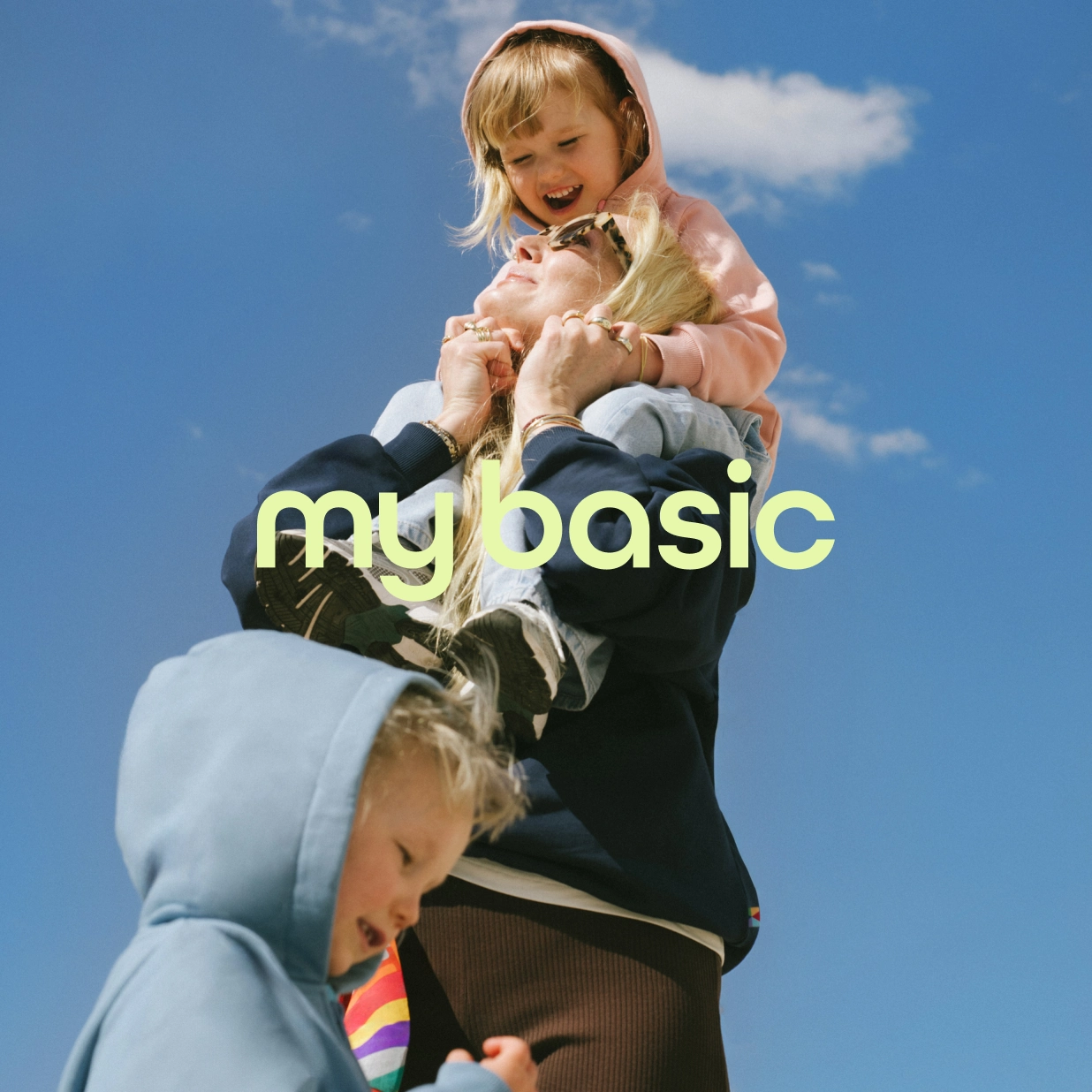
We based the typography on the Athletic family from Family Type - its simple, functional base brings order to communication, while its different styles let it add character whenever the brand needs it. A new approach to photography moved the product from a packshot into real life - we complemented lifestyle frames with macro and super-shots that show the fabric, the detail and the quality of the make. We paid particular attention to the labels, one of MyBasic's most recognisable elements. We developed them for different product lines, keeping everything customers had come to love about them.
Key Visual
One system, one effect: instant recognisability across every channel.
Instead of creating a single layout that wouldn't hold up across all channels, we built a system that lets you design different materials while keeping the same effect: instant recognisability. The starting point was utilitarian style - order, function and everyday comfort. That approach comes directly from the MyBasic product, which forms the base of a wardrobe, mixes easily with other pieces and works every single day.
But we didn't want functionality to strip the brand of the optimism its community had loved from the start. So we created a tension - Fun in Functionality. We paired order with bold colour, play and unexpected combinations. Structure holds the system together, while colour gives the brand its personality.
The system works across social media, campaigns, print, ecommerce and physical space. Because of that, a single post or banner can look like MyBasic without having to feature a large logo. It was important to build a system that could adapt both to communication for children and to the world of adults. In materials for children, greater modularity and more play give the labels a freer character. In communication for adults, simpler layouts and bold colours build a more decisive language. The system shifts its tone, yet stays recognisable as MyBasic.
Digital Experience (UX/UI)
An ordered path to the product, where colour became a tool for navigation and sales.
The MyBasic store had everything it needed, but its structure didn't lead the customer to the product as smoothly as it could. We redesigned the main navigation: product thumbnails and a new menu layout shorten the path to purchase and, along the way, encourage discovery of more products.
We also introduced search by colour - because if colour is what sets MyBasic apart, it should also be the way a customer searches. Icons and curated photography carry the new identity down to the smallest details of the interface, showing clothes in real homes and real situations rather than on a neutral background. Ecommerce stopped being just a catalogue and became an extension of the brand.
mybasic.plColour system
Consistency without guesswork - and independence from trends.
Colour is what sets MyBasic apart, not an add-on - which is why it deserved its own system rather than a random pick. We built a complete framework for choosing shades based on three principles: analogous combinations for everyday communication and the lookbook, contrasting ones for campaigns and CTAs, triadic ones for seasonal activations and children's materials. Each principle has its own use and its own logic. On top of that, a palette system that lets anyone creating content for the brand stay consistent without guessing: you identify the colours in a creative, match them to the palette, choose by the rules. The brand doesn't have to chase trends - it builds its own seasonal language that stays recognisable no matter the collection.
Communication Platform Launch
A rebrand as a moment the brand celebrates together with its customers.
We planned a full launch of the brand's new chapter, from narrative strategy to content production. We based the "Ready for every day" platform on the insight that it's precisely in everyday life that the brand gives customers the most value: it simplifies choices, helps build a wardrobe and gets the whole family ready for different moments of the day. To tell the story of the rebrand itself, we reached for the metaphor of growing up.
MyBasic was nine years old, and the change didn't mean cutting off from the past - it meant stepping into a new, more conscious stage of the brand's growth. So the growing-up metaphor became the axis of the launch narrative, while everyday life remained the strategic foundation of the whole platform. We produced a hero video with real families who choose the brand every day. It all closed with an event in Warsaw, a celebration of the brand's birthday and its new chapter, from the first post to the final frame.
Art Direction & Content Production
Authenticity that sells - an emotional story backed by a product argument.
We were responsible for the art direction of all the launch content, from the core idea, casting and styling to locations, movement and the composition of every frame. We produced a hero video and social media materials, showing the product in natural use, because that's where the "Ready for every day" platform works at its fullest.
Casting: real families who wear MyBasic every day. Style: natural, centred on everyday life. We combined natural shots with macro and super-shots showing the fabric, the texture and the make - so the emotional story also supports the product's sales arguments. The images complemented ecommerce, giving it a more premium yet still approachable, human character. They expanded the lookbook content and created materials that work across many touchpoints: on the site, in social media, in newsletters and in future campaigns.